


Chicken Stock Re-Design
Adobe Illustrator / Adobe Photoshop
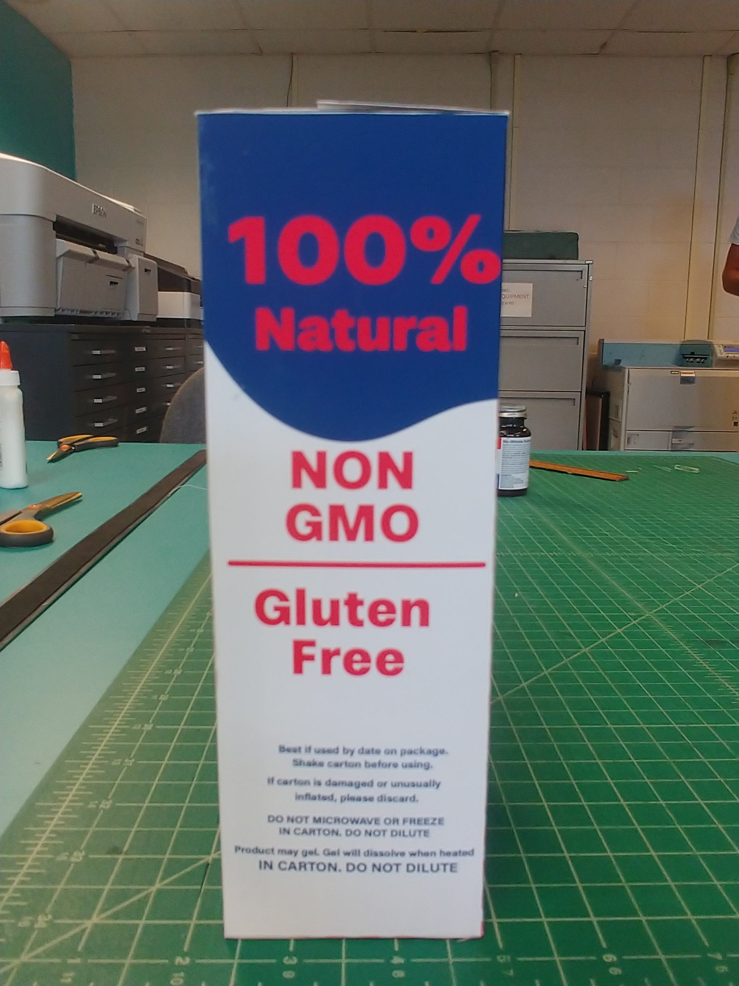
Having a catching image on packaging is important, especially if you’re trying to sell a product to consumers passing by the store shelves.
For this project, we were tasked with creating a new package for a pre-existing one that had a weak overall design presence
I decided to focus on the popular Swanson Chicken Stock and give it a new coat of paint.
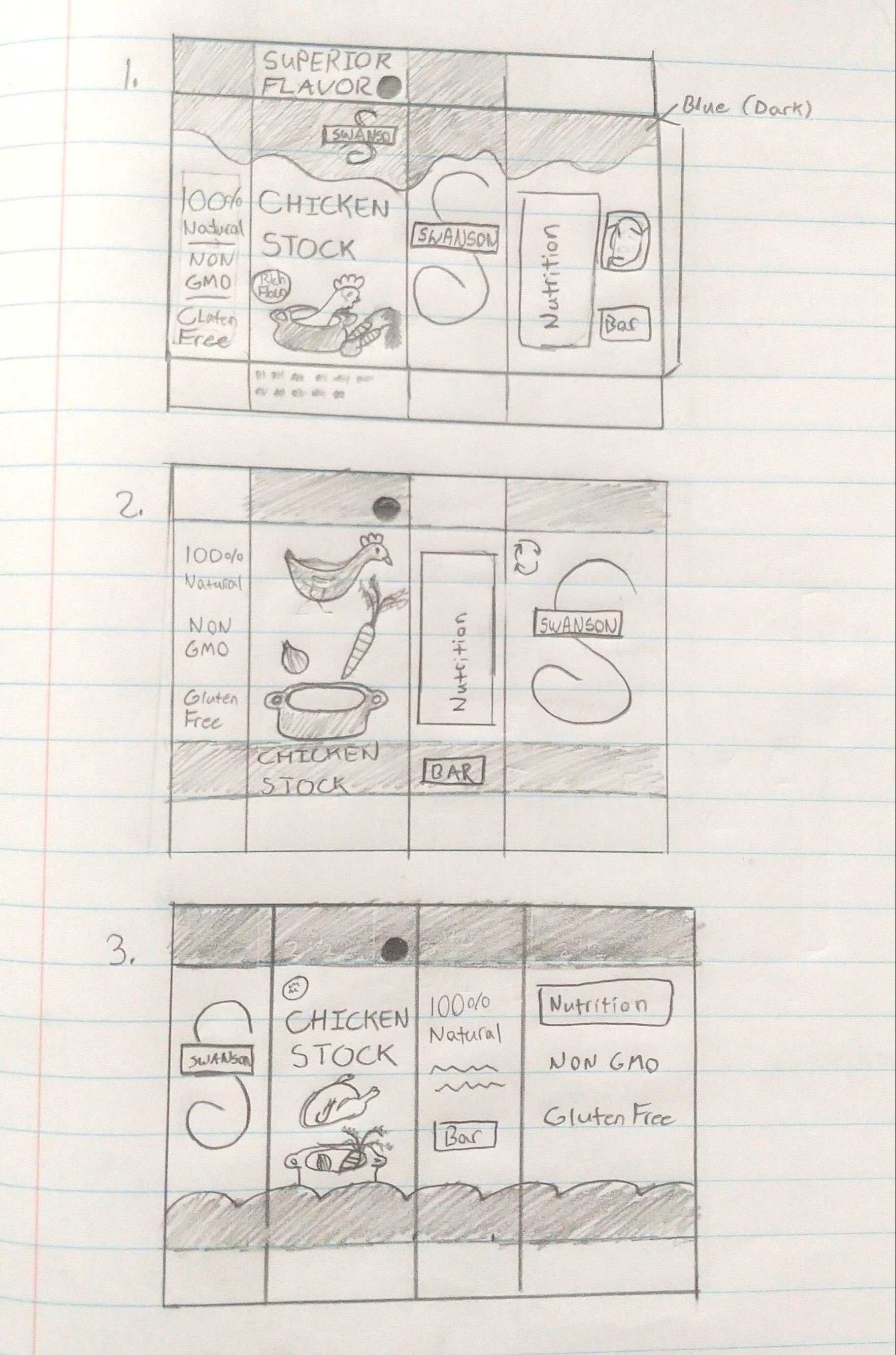
First, of course, I began with some simple thumbnails and sketches.


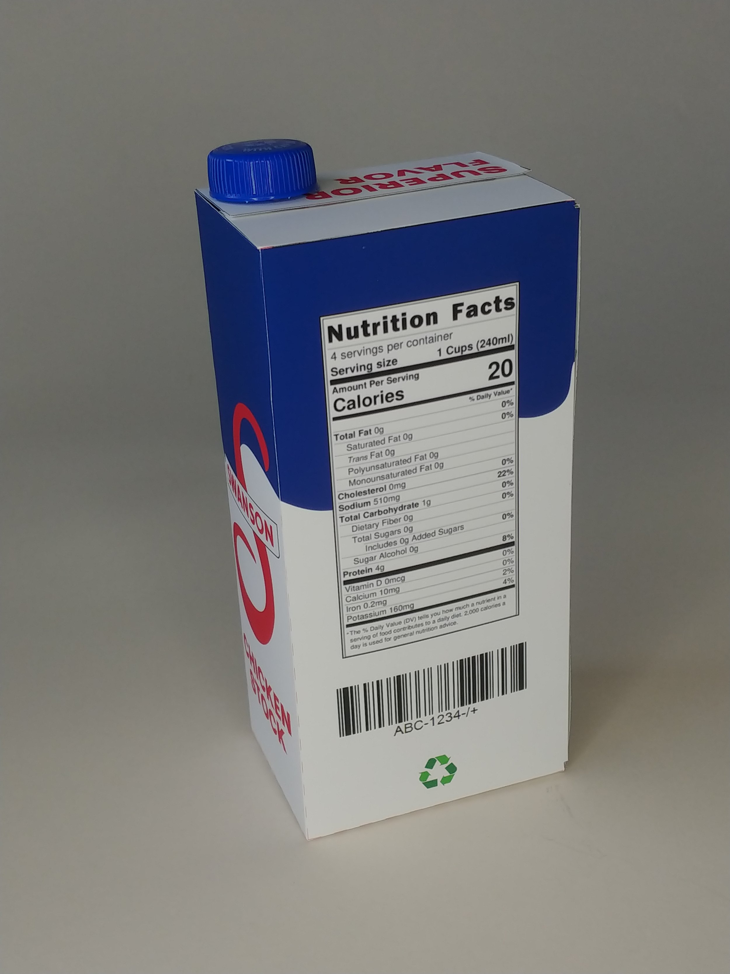
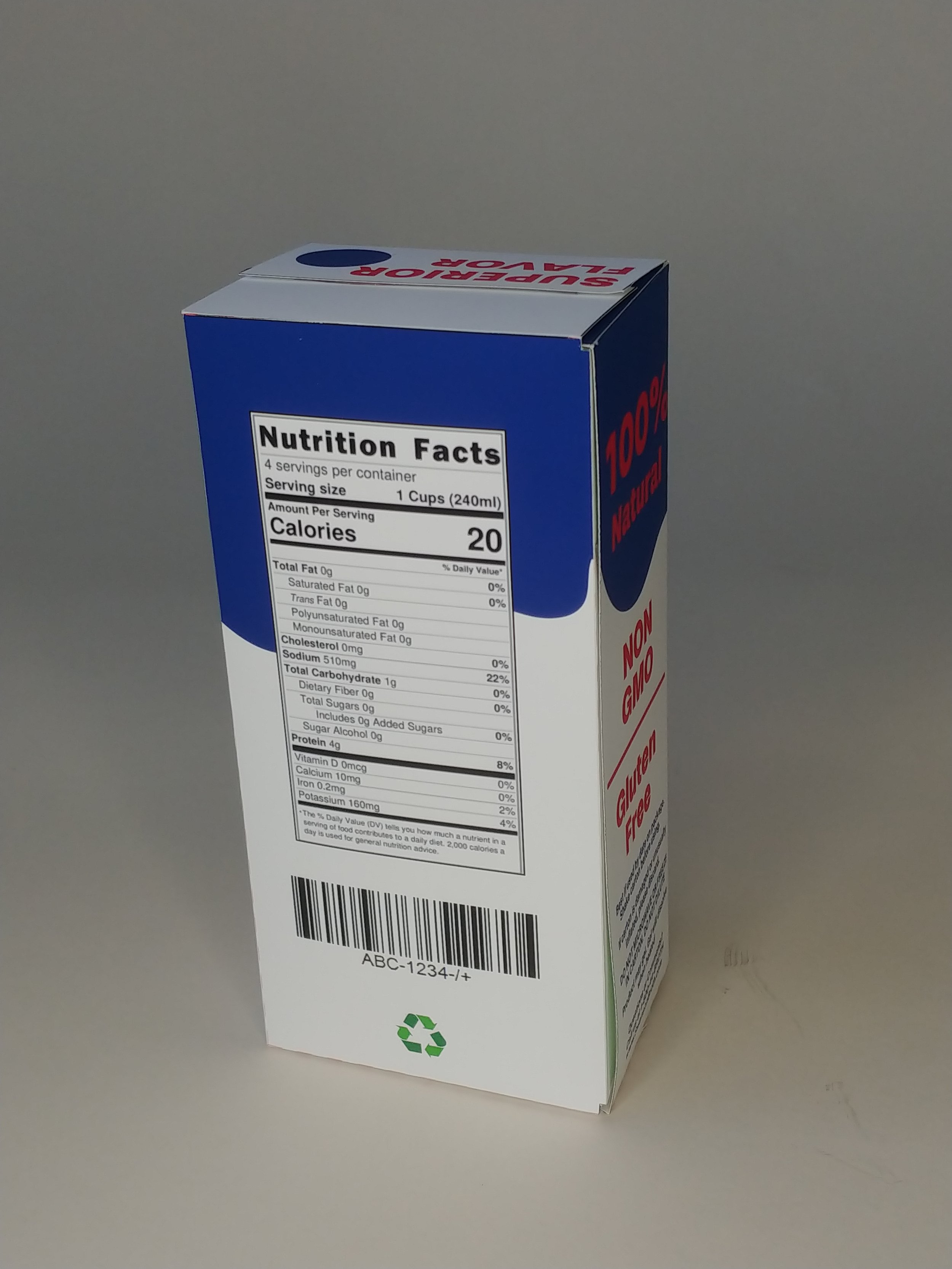
After laying out the package itself, I applied the design, refitted, and resized it. I wanted to make the box more interesting at a passing glance, while still including the important elements of the original design.
I decided to include an element of dark humor as well (the chicken sitting in the pot). I figured it would make for a more eye catching or memorable piece.
With this being the first iteration of this design, it was quickly followed up with an in-class critique. After the feedback from my peers, I made refinements to create the final design (see the design at the beginning of the page).


Since we had to create a 3D version of our designs, this was the first iteration of the design in a physical format.